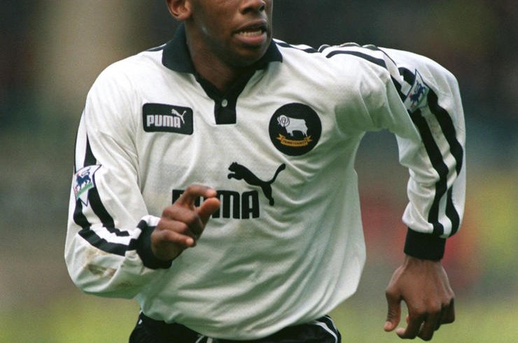
20. Derby, 1997/98 (home)
For some reason, shirts became incredibly baggy in the late ’90s – picture Steve McManaman hurtling along in a long-sleeve that looks like he borrowed it from a much bigger brother.
However the Rams’ natty Puma-made white effort was one of the few that looked bang on, particularly when modelled by confusing human-octopus hybrid Paolo Wanchope: a mass of limbs, skill and confusion wrapped in a shirt the size of a beach windbreak.

19. Everton, 2015/16 (home)
A little turret and a couple of elephants can only enhance a football shirt, and while all of Umbro’s efforts have been admirable, 2015/16’s version was possibly the best, making Leighton Baines look every inch the mod idol.
18. Nottingham Forest, 1992/93 (home)
Some will lobby that the bold 1994 effort you might picture Stan Collymore or Jason Lee striding about in was better. But this effort tops it for our money, thanks to its subtle pinstripes, understated logo, and the sponsorship of Shipstones, a decent, gritty local brewer that chimes better with Roy Keane’s ultraviolence than Canadian swill-merchants Labatts, who took over the following term.

17. Sheffield Wednesday, 1992/93 (home)
The Premier League still doesn’t seem quite right without former top-flight stalwarts Wednesday in it. Their ’92 season strip was a knockout: another Umbro effort, worn with aplomb on the wing by The Waddler.

16. Manchester City, 1993-95 (away)
City may have been a shambles on the pitch, but their Umbro tops were always super sharp. The understated Cambridge blue and the pinstriped white away versions particularly stood out, and were iconically donned on Cool Britannia lads mag covers by Liam and Noel Gallagher – making the ‘Brother’ sponsor seem even more apt.

15. Wimbledon, 1994/95 (home)
Wimbledon never did anything by the book, and brilliantly didn’t even bother having a kit supplier in this season – instead getting ‘The Crazy Gang’ embroidered over the heart. An unusual combo of dark blue and yellow trim, it’s the only kit you’d want an opponent to be wearing as they lightly twisted your testicles or spat foul insults about being an orphan down your earhole.

14. West Brom, 2016/17 (home)
Baggies kits looked amazing in the 1960s and ’70s, before running a gamut of awfulness through much of the next three decades. But this effort was genuinely stunning: with UK-K8.com’s Chinese lettering (凯发娱乐) combining perfectly with the traditional old stripes, it looked like it was beamed down from space (in a good way).


